Archstone – Brand Identity
Graphic Design
Creative Director

Project Summary
Archstone Equipment Rentals launched as a new company with a tight budget and a clear vision. Working within those constraints, I built a brand identity from scratch that's minimalistic but undeniably striking. Limited budgets often lead to better creative decisions, and in this case, it forced every choice to count. The result is a brand built to last.
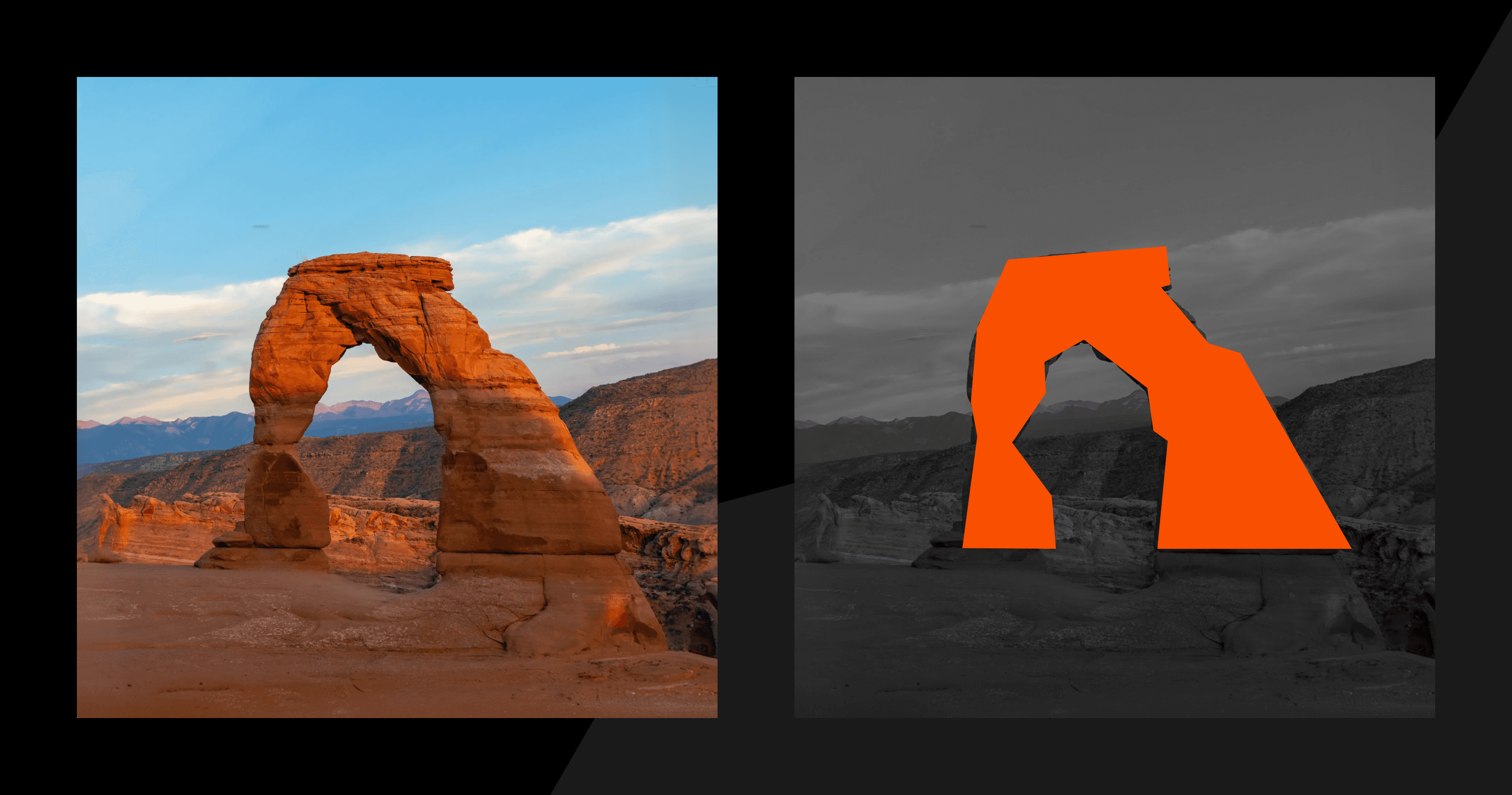
The Logo: Nature Meets Industry
The client's only creative direction was the delicate arc found in Arches National Park. From that single reference, I built a minimalistic mark using sharp angles that capture the landscape inspiration. The saturated orange doesn't whisper, it demands attention. Simple enough to work at any scale, bold enough to stand out in a market full of generic logos.

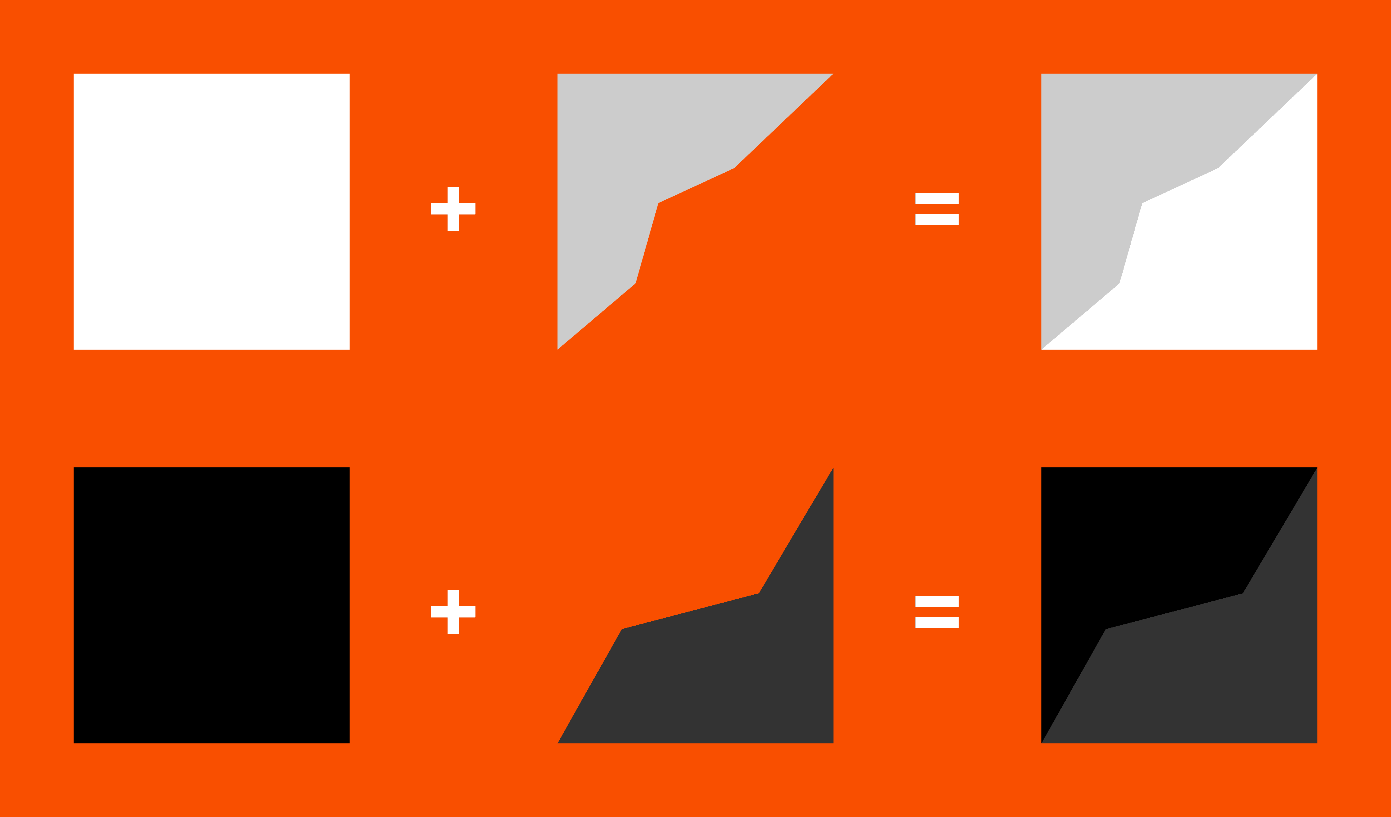
Simple Pattern That Just Works
Beyond the logo, I developed a geometric pattern system using the same sharp angles that define the mark. These shapes sit subtly in the background of every asset, adapting through slight shifts in tone depending on what's behind them. The result echoes both the canyon stones that inspired the brand and the minimalistic approach that makes Archstone instantly recognizable without ever feeling overdesigned.
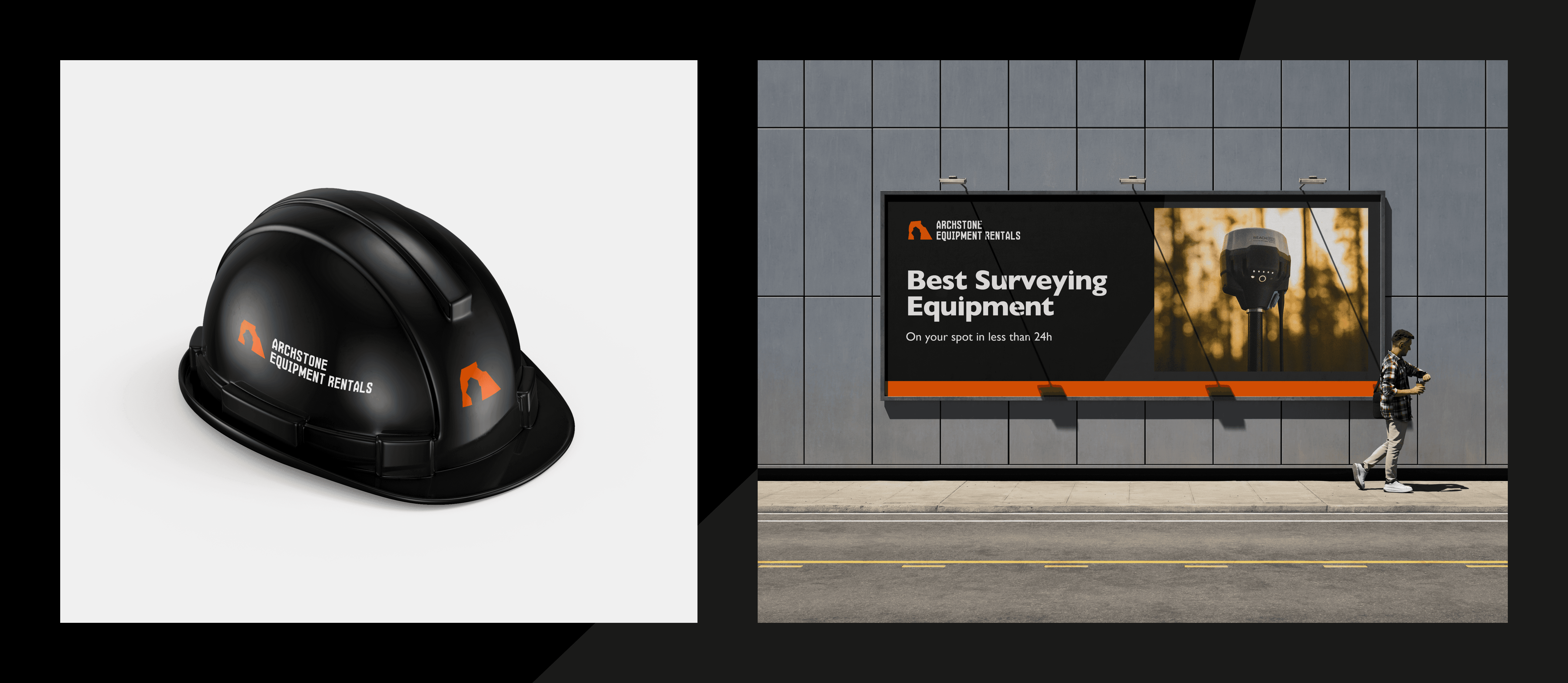
The Work
On a shoestring budget, we created a brand that stops you in your tracks whether it's printed on a safety helmet or plastered across a billboard. Minimalistic enough to be timeless, bold enough to demand attention in an industry that doesn't usually get either. That's the whole point.