Azena – Brand Identity
Graphic Design
Creative Director

Project Summary
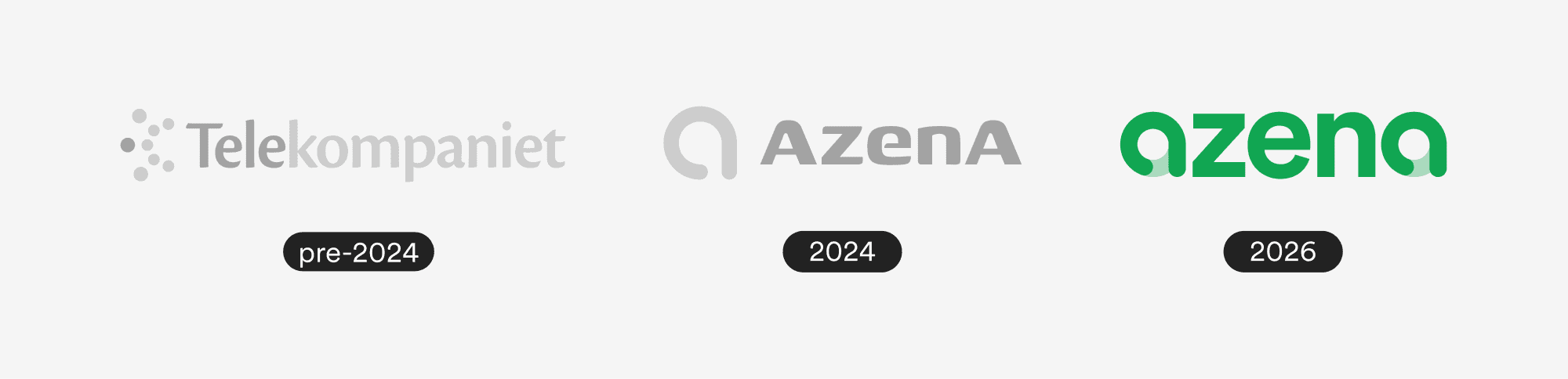
Azena, formerly Telekompainet, is a Swedish communications provider with nearly 30 years in the market. In 2024 they underwent a full rebrand including a new name, visual identity, and brand direction. What started as minor color refinements in early 2026 quickly revealed an opportunity to push the work further. The logo and visual system had potential that hadn't been fully realized, so we took it back to the drawing board, keeping the core concept but sharpening every detail of the execution. The result is a brand identity that finally matches the weight and experience of a company that's been in the game since 1997. Clean, confident, and built to last.
The Idea Behind the Brand
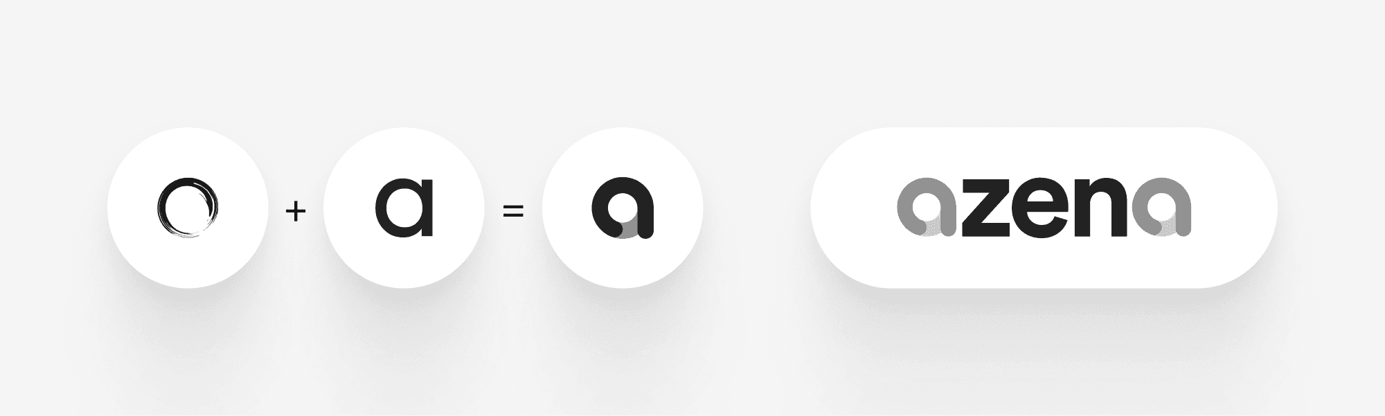
Azena is built around a single idea: Zen. The glyph merges a broken circle, a traditional Zen symbol, with a lowercase 'a'. The logotype takes it further by placing 'zen' between two matching 'a's, making the concept impossible to unsee once you notice it.
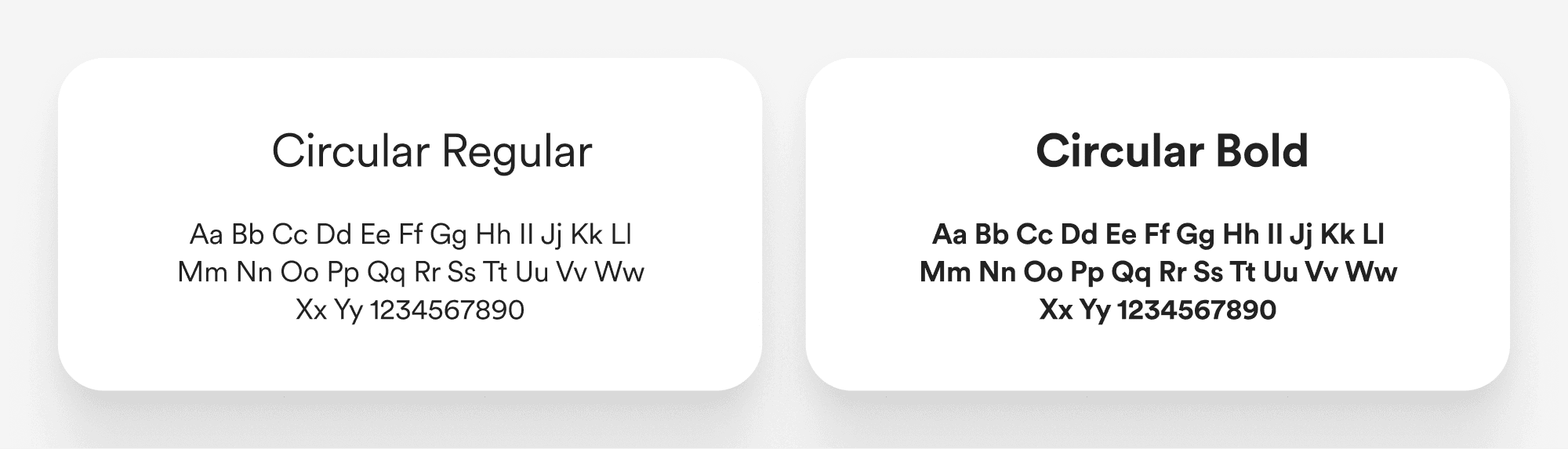
Typeface
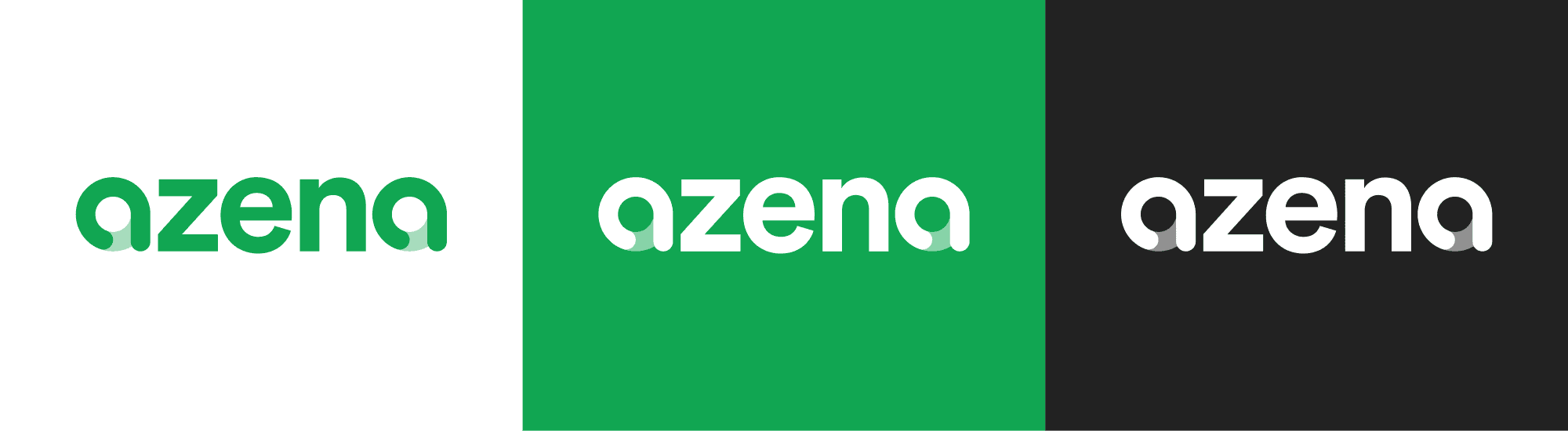
For Azena we selected Circular, a premium typeface that brings warmth and clarity to every touchpoint. The updated brand shifts to Regular as the primary weight, a deliberate decision to balance the visual weight of the heavier logo.
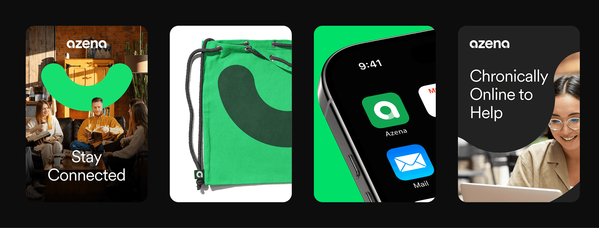
Brand Device
A single stroke pulled from the base of the 'a' glyph becomes the brand's most versatile element. The shape reads as both a smile and a phone icon simultaneously, nodding to the friendly, approachable nature of the brand and the communication services behind it. Simple enough to work anywhere, recognizable enough to be distinctly Azena.