Rootchat – Brand Identity & Mobile App & Website
UI/UX
Creative Director, Lead Designer

Project Overview
Over the course of a year, I led Rootchat from blank canvas to shipped product across every discipline. As Creative Director, I built the complete brand identity from scratch, developed a custom atomic design system that became the foundation for the entire app, creative directed a team of illustrators to build the character system, and oversaw the design and delivery of both the mobile app launched on App Store and Google Play and the marketing website. This wasn't just design work, it was building the entire visual and structural foundation for a cross generational communication platform.
Logo and Wordmark
The Rootchat logo does more than identify the brand. The leaf shape nods to family roots, while three integrated dots reference the typing animation familiar to anyone who's ever waited for a reply. It's a small detail that immediately tells you what kind of app this is before you've read a single word.
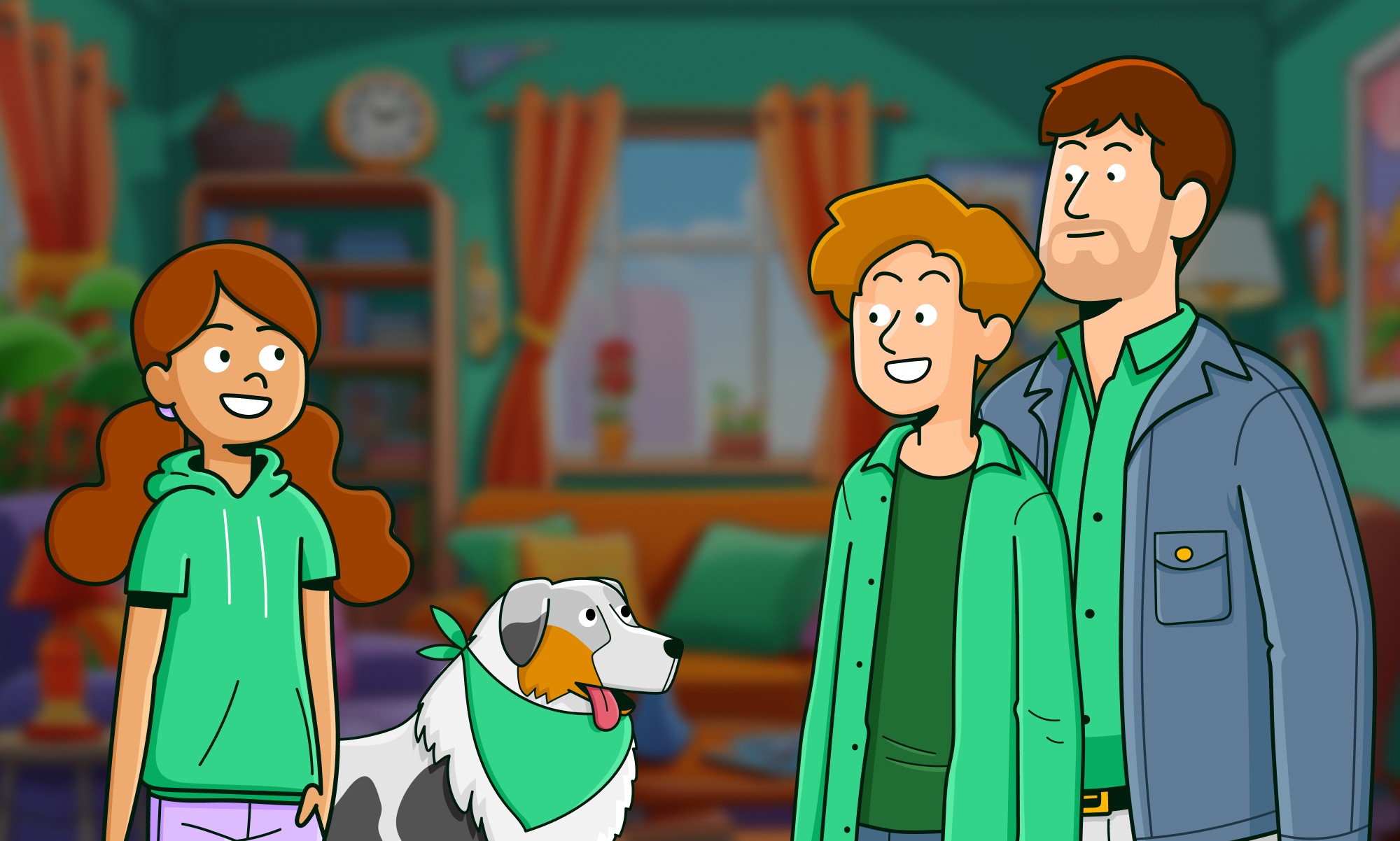
Illustrations
To bring the brand to life beyond the interface, I directed a custom illustration system built around a diverse cast of characters spanning different ages, races, and backgrounds. The goal was simple: anyone picking up the app should see themselves in it.
Brand Pattern: Bringing Families and Cultures Together
Rootchat was built by a team spread across multiple countries, and the brand pattern reflects that. Designed to work across both marketing assets and in-app chat backgrounds, the pattern carries subtle cultural references that honor every country that contributed to the product. Versatile enough to scale, personal enough to mean something.

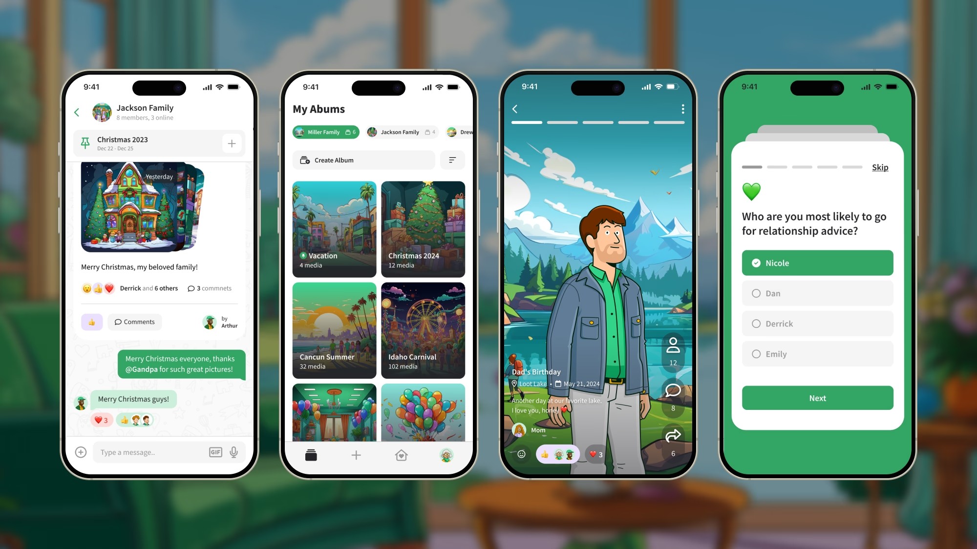
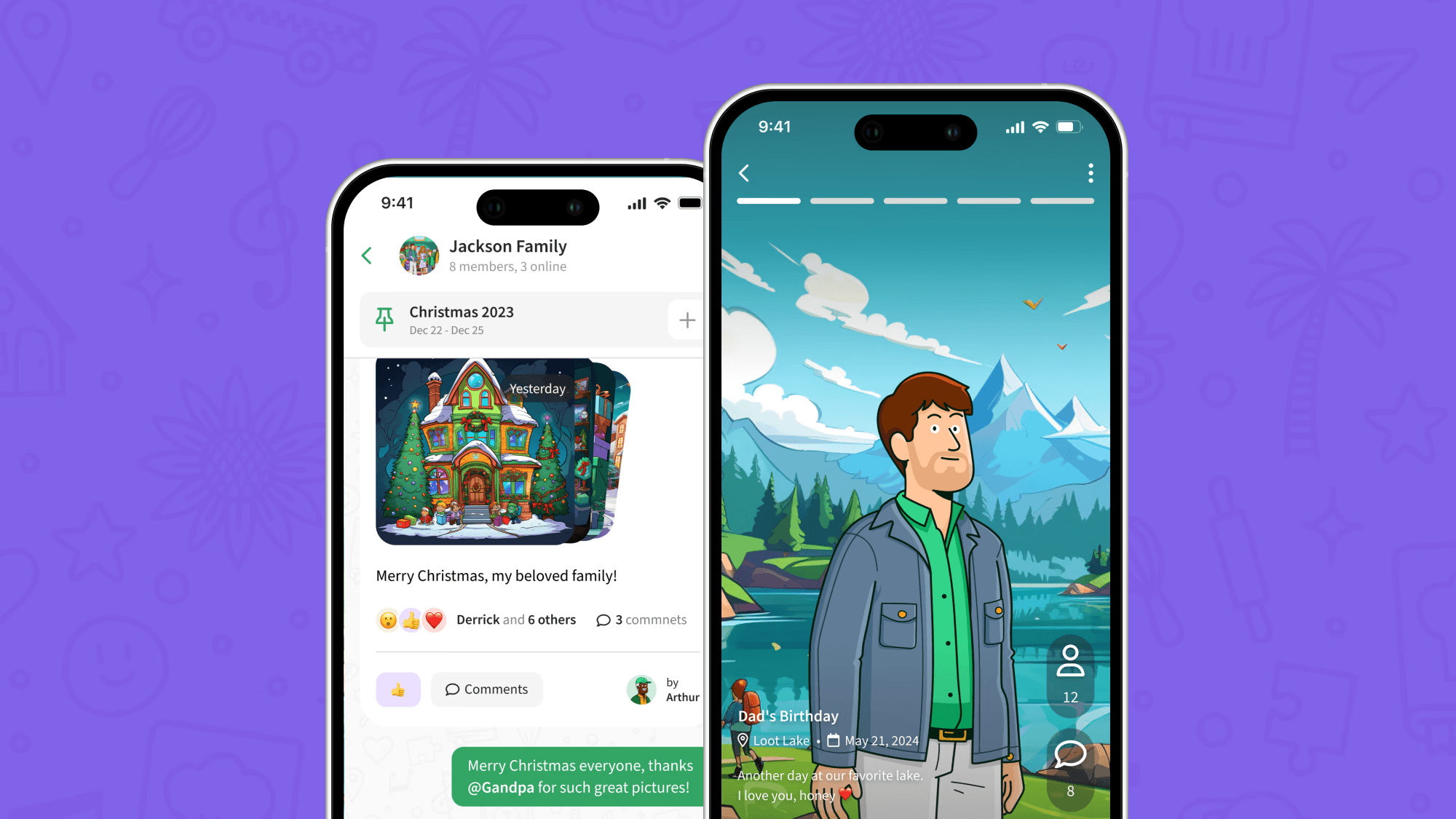
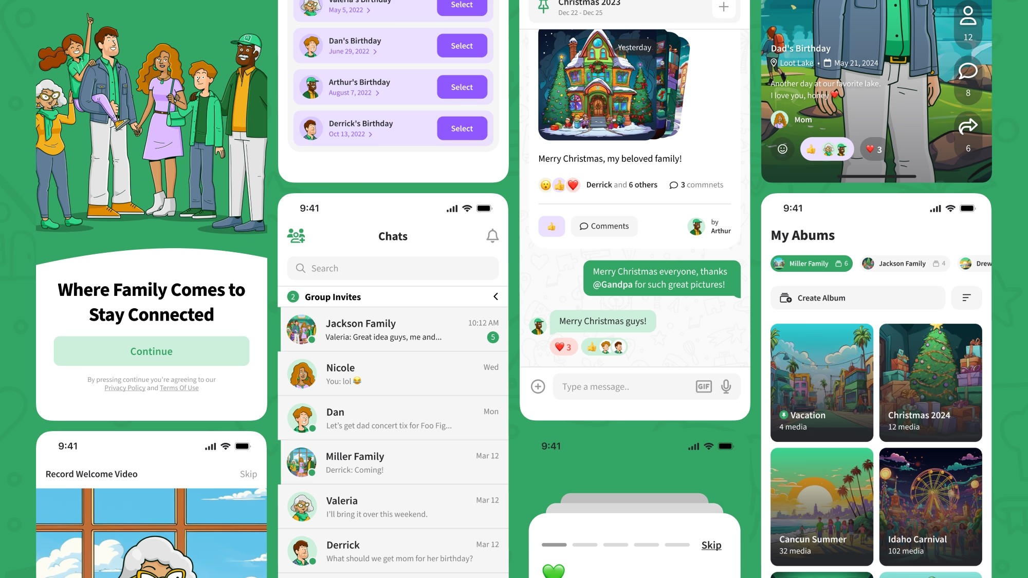
Breakthrough Features for Seamless Family Sharing
The app was designed around how families actually communicate, not how designers assume they do. Multimedia posts, story updates, real time reactions and comments all built with cross generational usability as the baseline, not an afterthought. If your least tech savvy family member can use it without help, the design did its job.
Website
To support the App Store and Google Play launch, I designed and shipped a full multipage marketing website. The layout leans into a bento grid structure to surface key features quickly, with custom Lottie animations adding an interactive layer that makes exploring the app feel like part of the experience. Live at myrootchat.com


